Dex UI was a journey that brought me to realize a great respect and passion for design. The dev log, though originally an experiment, turned out to be hugely motivating and so I made it the main emphasis of the site.
I kept a dev log while working on Dex UI. Sadly, I let it disappear between site updates. The only copy of some of these posts I had was on a backup of a previous host I had saved into a tarball before migrating hosts.
Here it is in one place again for posterity.
Dev-Log: 2014-10-01
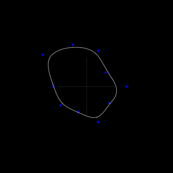
I wanted to create a smooth curve that passed through a series of n points, leading me to explore BSplines (with the help of this pdf).
Dev-Log: 2014-10-02
I was looking into procedurally generating topography maps and Perlin noise worked well for generating the terrain height. The project itself didn’t really turn out, but got a neat gif out of it (on gfycat).
Dev-Log: 2014-10-25
I think the real reason why I installed Linux on my desktop was because I could customize my desktop environment. When I first started, I knew nothing and everything was amazing. I kept learning and honing my setup until it slowly reached a steady state. It worked well, looked nice and that was it.
Then it just… became boring. Every new screenshot I saw was the same: there’s a menu bar and there are windows. Sometimes they float and sometimes they tile. Half the beauty is in the wallpaper and the colorscheme and nothing felt innovative anymore.
On the other side, movies are portraying computers with these gorgeous sci-fi interfaces. Like absolutely incredible: Tron and Oblivion and Guardians of The Galaxy. Why don’t desktops look like that? They should. I want that.
But when you start to look into it, they’re really damn inflexible. They’re unusable and unnecessary: you have multiple views of the same data on screen, precious real estate going to data that is permanently displayed instead of on request. They are expensive: the entire interface is visually continuous because every program must have a custom design, often animated (an immense increase in effort). And finally the setup is fixed. Window managers have an incredible flexibility in letting you contextually adjust your setup. When I develop I might want two windows open. For browsing, maybe just a single web browser fills the screen. The switch is an unnoticeable press of a few hotkeys, not a hours of piecing together a new interface.
So what I’ve seen people do with their setups is constrained by productivity, but what happens when a bit of this productivity is sacrificed is still vastly unexplored. These CGI interfaces are undeniably beautiful and I am making a project of turning them into reality.
I’ll keep the dev log posted with my progress, maybe writing some longer posts too. I also spend a lot of time finding inspiration for this sort of thing so maybe I can get a Tumblr or repository going for what I find.
Dev-Log: 2014-10-30
Animations are a large part of what makes the desktop from Tron Legacy board room (gif) stimulating. Things flicker and ease into place in a mesmerizing fashion, instead of just appearing instantly. Having this level of smooth animation is critical in creating a more cinematic desktop, so I’ve spent the better part of the last week looking into this.
To create the animations themselves, I’ve turned to experimenting with OpenGL/openFrameworks/Processing. The larger implementation obstacle however is making these animations appear as a seamless component of the desktop environment, when in reality they are constrained to windows. The idea is to limit the usable screen space to a portion of the screen and have the interface animations occur behind the windows as an animated “wallpaper”. If this is kept visually seamless with the windows in front, the animations will appear to be a part of the desktop environment.
Unfortunately I haven’t found a way to encapsulate an arbitrary program into the root window (what acts as your wallpaper in the X Window System), only how to set the pixel contents like programs such as xsetroot and feh do. So instead I added a mode to my window manger BSPWM that pushes a program window to the back of all other windows, keeps it full screen and ensures it persists across desktops, essentially making it visually be functioning as the root window. This is an awesome first step as now I can implant any custom interface into the desktop and move onto designing and animating the interfaces.
Dev-Log: 2014-11-01
Experimenting with text rendering and the possibility of kicking off the opening animation with a welcome message.
Dev-Log: 2014-11-11
(Still working on making a sci-fi movie-esque interface function and live on my desktop.)
The iterations of the layout designs thus far. Still no color, and a lot of ripped graphics (via Oblivion & Tron mostly) but using them to refine sketches.
Around halfway through, I committed to a layout and started prototyping elements in Processing and openFrameworks, but found I overextended myself with the design. A lot of the visual tricks that might make a motion graphic interface pretty (glow/blur, super high data sample rate for graphs) weren’t entirely feasible and without them things looked kind of shitty. I had to take things back with proper idea exploration, but now I’ve settled on another design, one that feels a lot more coordinated.
Point is: prototype cheaply. A smarter, more experienced man might have said the creative process starts with broad ideas and then is a series of refinements. I was not this person. I committed to only a single idea from the start and it was painful when it became a limitation.
Other cool things the past few days:
- I started sciencefictioninterfaces.tumblr.com as a repository for some of the interfaces that are particularly inspiring. It’s been pretty successful so far, but I’m learning a well organized Pinterest is a might be a better setup.
- gmunk retweeted me and hes one of my heroes so that was actually really cool.
- This sumarizes my week
- Blender seems to be the go to typeface for interfaces, used in at least Oblivion, Sony Mouse & Cat advert, Tron and Ender’s game.
Dev-Log: 2014-11-16
With the design for the display interface settling, I’ve moved onto prototyping individual elements, starting with the keyboard.
Half my work has been research, and for the keyboard, I’ve heavily referenced the Tron Board Room keyboard by gmunk and the tablet keyboard from Ender’s game by Ash Thorp. My entire design draws inspiration from the Tron Board Room display and having a visually clean keyboard fits the theme well. The more intricate designs like those in Guardians of the Galaxy by Territory Studio and the OVH Summit interface by likidea quickly looked cluttered. Since the reference images laid out the design so clearly, I went straight to prototyping in Processing and handled the design details while programming.
The keyboard’s real time to shine isn’t with the design though, it’s the animations when it opens and transitions into existence.
For the individual keys, alpha transitions begin with an ease in followed by a out back ease to overshoot the final brightness, giving them a nice burned-into-the-screen feel as they appear. To remain consistent with the way other components (e.g. terminal, status bars, etc) will animate, they also flicker as they start to appear.
The entire keyboard feels stiff when animated into existence all at once, so I began to experiment with different creation motions. Here’s a series of different creation motions.
In the first, all keys appear together, again feeling stiff. The second moves onto something more dynamic with a flow from left to right that is quite fluid but when put in context and placed in the center of a large screen looks out of place. This led to an animation that starts from the center, and then to a final version which adds a bit of random offset play into the flickering over a purely fluid rendering feel.
When in action the keys will be illuminated and then fade with a slight flicker.
For next time I will continue to prototype the larger elements, which will give context to the other more complex graphs and visual displays. I worry a little about it looking too Tron-like but hopefully as the entire interface comes together with a colorscheme, it will develop its own flavor and style.
Dev-Log: 2014-11-25
I’m still putting together animations and images, so I don’t have much to show until next time, but I’m still at it. Today’s about the refactoring has been happening this past week.
If I didn’t need my programs to respond to input, I would be working in Cinema4d and/or After Effects like most professionals use to build their interfaces. So when I began prototyping, I tried to build a similar setup in my environment with proven animation tools like keyframes and timelines, using tools like ofxTimeline, an openFrameworks plugin for that sort of thing. It’s some sweet stuff, but what I could slap together just wasn’t for me. It wasn’t as smooth as the professional programs and the animations I produced with it were always slightly off: the timing was wrong, coordinating multiple objects was awkward, and it just looked sloppy. Example from before, used ofxTimeline.
Since then, I’ve been keeping things simple and figuring stuff out as I go, and I’ve had success relying heavily on a frame counter and scheduling animations with it, using easing equations (some standard, some custom) and a simple function for flickering. It’s a bit tedious when iterating as I’m still defining my parameters compile time, but animations come out much slicker, making it worth the cost.
However, I’ve been copying these functions and tools from file to file and, along with the inconsistent function interfaces, performance issues and other cruft, this week it just finally caught up to me. Prevailing prototyping advice may say not to care about code quality, but the unneeded complexity was inhibiting my ability to prototype. I’ve had to take a step back with my progress and standardize my tools and, making them into little libraries.
Other fun:
- Lorcan O’Shanahan, producer of some of the finest interfaces, found me through sciencefictioninterfaces.tumblr.com and I briefly got to talk to him over Twitter!
Dev-Log: 2014-12-31
On Design Iterations.
Well you know, finals and holidays, one day becomes the next and then its over a month since the last dev log. Luckily though I have been working (some).
Throughout the project, the theme is heavy upfront prototyping, sketching out designs, then testing them in Processsing (to see how they look when coded), and then (someday) moving to OpenFrameworks for performance and some other technical reasons.
Iteration 12
Last I demo’d these designs, we were on iteration 12. There were three problems I had with iteration 12.
First off, I just didn’t like the headers. They drew the eye away from the core of the design, and they were pretty ornate compared to the rest of the design, which was overly bare.
Problem number 2: translation from Sketch to Processing was far from 1-1. I would be using placeholder graphics which, while they captured the gist of what I wanted, the coded product was far from the design sketch. Often times it would feel too sparse, even when my designs where already pretty bare to begin with.
And finally, there was a real lack of visual consistency that became apparent from the previous two problems. Whatever variation on the header I came up with failed to fit into the style of the graphs I was creating in code. There was no sense of where borders belonged and how they should look and affect surrounding elements. This issue also opened me up too much to inspiration; I would try to incorporate any graphic or style I liked into my own interface, without a guideline for what belonged and what didn’t. Even the grid began to deteriorate and it was time to start again.
Iteration 16
In iteration 16, you can see a variation in the header I pursued. It didn’t work out, but it also started to incorporate graphics I could be confident would reproduce reasonably in code. Those graphs were hideous though, and more importantly, the lack of consistency is even more apparent here. Some text (under the time) are inset with ticks, while the header has neither ticks nor text indentation. The double header border is also unique and doesn’t really fit with the rest of the design.
Iteration 21
Here’s when things started to click. After seeing the Ghost in the Shell Homage, I tried to draw heavily from the titles: the color fit my design well and I used it, more abstractly, to give me a sense of what belonged in my design. I settled on using ticks and indentations as subtle ornamentation and got a better sense of the weight of objects and what kinds of graphics I could use. All the graphics I created myself rather than rip images to make the translation to code easier. And now, even the headers fit!
There’s still more I want to do, especially on the color front, and the right side of the terminal has yet to be designed, but I’ve begun work in OpenFrameworks. The layout has settled again, and now some of the design work becomes how it looks in motion. Also this project has been dragging on a bit longer than I’d like, so it’s time to start putting the pressure to complete it.
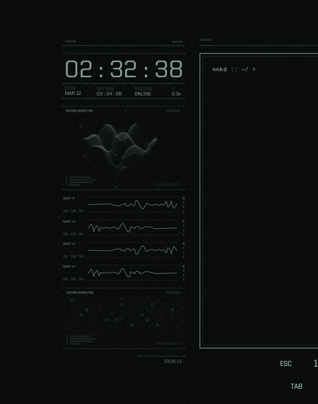
Dev-Log: 2015-01-01
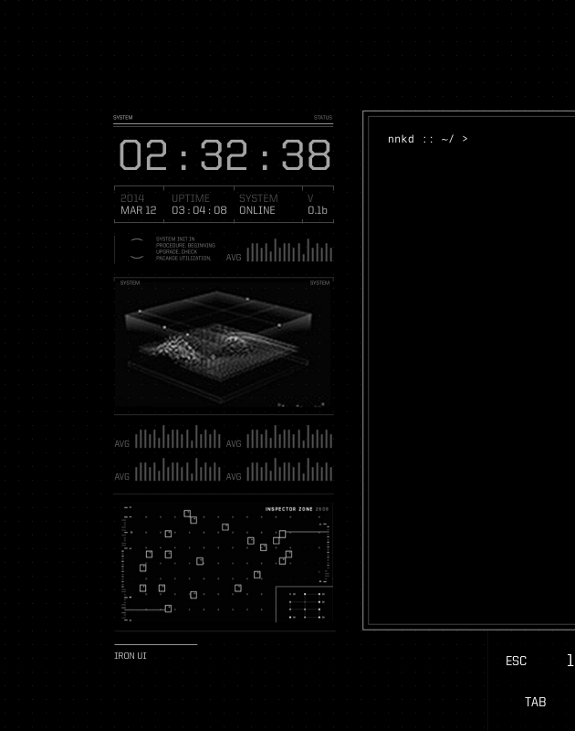
Here’s a quick look at today’s work on the right side design. The right side has a bit of repetition right now, but once the elements are coded an in motion it should al leviate this feeling. Also the graphs will look less dorky than what I could do with the pencil tool.
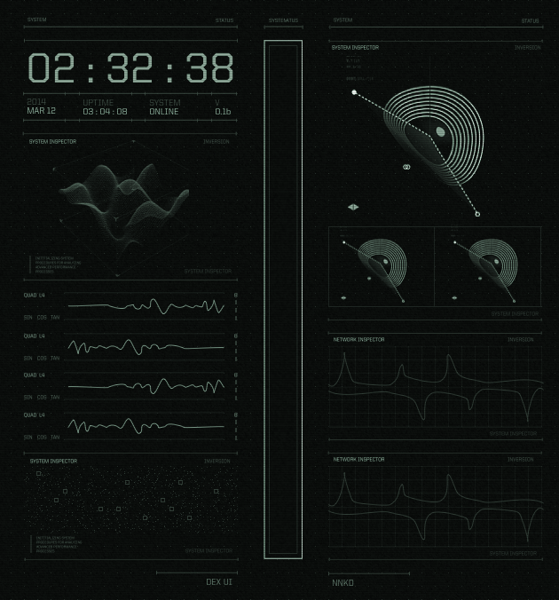
Dev-Log: 2015-01-04
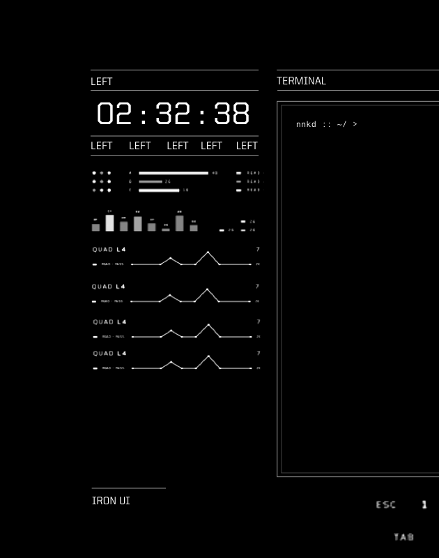
Here’s a preview of the UI left side implemented in openFrameworks. The time skipping is a byproduct of exporting the frames to record this.
Dev-Log: 2015-01-09
For the radar visualization (top of the right panel) wanted to achieve the look of this graphic by Anton Repponen, sort of like a warped circular radar, bent at certain points. Previously, I’ve used sequences of bezier curves to create a b-spline (continuous at the second derivative, as described here, and animating it by only controlling the points along the control polygon/a-frame. For example, the four graphs on the left panel use this technique.
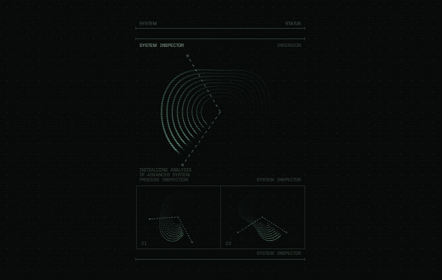
For the radar, we just added the third dimension. The control points were constrained to a sphere, so while the spline still retains somewhat of a circular shape, it still appears warped:
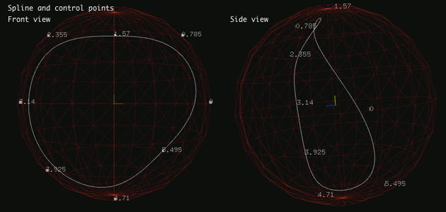
The spline was then just repeated, slightly smaller each time for the concentric rings look. Making the curves anything more than hairline thin was the main challenge behind this animation. From what I’ve found OpenGL 3 refuses to allow anything above 1.0 for glLineWidth, and the conventional solution is to make each line a quad. For a bezier curve, this meant subdividing it into sequences of lines and then making each line a quad with a geometry shader like so. This worked well in 2D, moving it to 3D has some problem with which way the quad is facing, but for my case it was subtle enough to ignore.
After that I made the spline fade away like a radar giving the final look:
Tomorrow I’ll upload the animation, and hopefully make some progress on the remaining components.
Dev-Log: 2015-01-12
Alright I didn’t upload the radar animation, but I’ve finished the entire right panel and keyboard making the UI completely statically done. All that’s left is the intro an imations and hooking it up to some real system data!
Here’s it running in Linux like a desktop, thankfully no real issues as I’ve been developing entirely in OS X so far.
2018 edit: This was a Vine video :(
Dev-Log: 2015-01-17
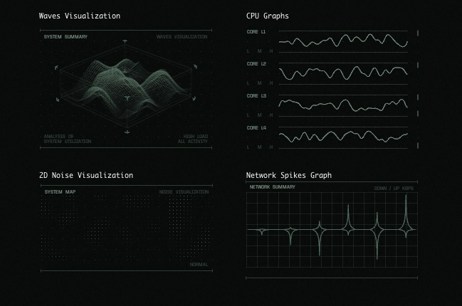
As I finish up the animations, I thought I’d go over the rest of the elements briefly.
The time display is self explanatory. Below it is the waves visualization which is a mesh that is displaced with a texture generated from 2d perlin noise. While I never ended up hooking up the visualizations to actual system stats, the idea was to take a measure of system activity (e.g. cpu activity) and make the waves flatter or larger with less or more activity.
Beneath is the cpu graphs, these are using the same b-spline technique as the radar, but limited to 2d and moving along horizontally. Below that is, again, a 2d perlin noise texture, but this time just displayed as dots rather than used to displace a plane.
On the right, other than the previously described radar there is the network display, which is just connected bezier curves (not via the b-spline technique this time, since I didn’t want the tips to be smooth).
The only element that really had to be hooked up was the keyboard, which needs to respond to any keyboard input even if it is to another program (like the terminal running above the UI). To do this I followed this method to read keyboard input via /dev/input. This let me see every key press, release and repeat, but only because I was basically keylogging myself.
Dev-Log: 2015-01-20
Yesterday was the release of Dex UI. It’s done way better than I ever thought, and since it’s garnered so much interested, I’ve been working on putting the source code on github. More on it later!
Dev-Log: 2015-04-19
Dex UI was a journey that brought me to realize a great respect and passion for design, and the past few months have been spent quietly pursuing and refining this interest. I’ve been exploring various 3D programs and renderers, learning my way around and finding my place and style. It’s been rough; it’s a completely different world to jump into, but there’s just so much potential that I can’t help but be drawn towards it. But even a few months later, I’m still trying to reach a point where I’m exercising creativity in addition to just developing technique.
I also invested some time in improving the website, as I had grown out of the previous version. The dev log, though originally an experiment, turned out to be hugely motivating and so I made it the main emphasis of the site.